.svg)
.svg)
Interaction to Next Paint Optimization for Mobile vs Desktop
Discover How INP Optimization Differs for Mobile & Desktop

Have you ever wondered how your experience with your favorite website varies drastically between your mobile device and desktop? It's no secret that user interaction on these two platforms is a whole different ball game. As a user, you expect a seamless experience across devices. But as a website owner or developer, inter-device performance parity is not as easy as it sounds.
But fear not; there is a silver lining in the form of Interaction to Next Paint (INP) optimization. With the latest changes in Core Web Vitals, Google now provides INP data for both platforms in Google Search Console (GSC). This will enable web developers to enhance site performance across devices.
This blog will explore the meaning of user interaction, why optimizing user interaction is important, and how to use INP to optimize user interaction. Learn more about the INP reports in GSC for desktop and mobile and the advanced strategies for optimizing INP.
Table of Contents
6.
7.
8.
9.
10.
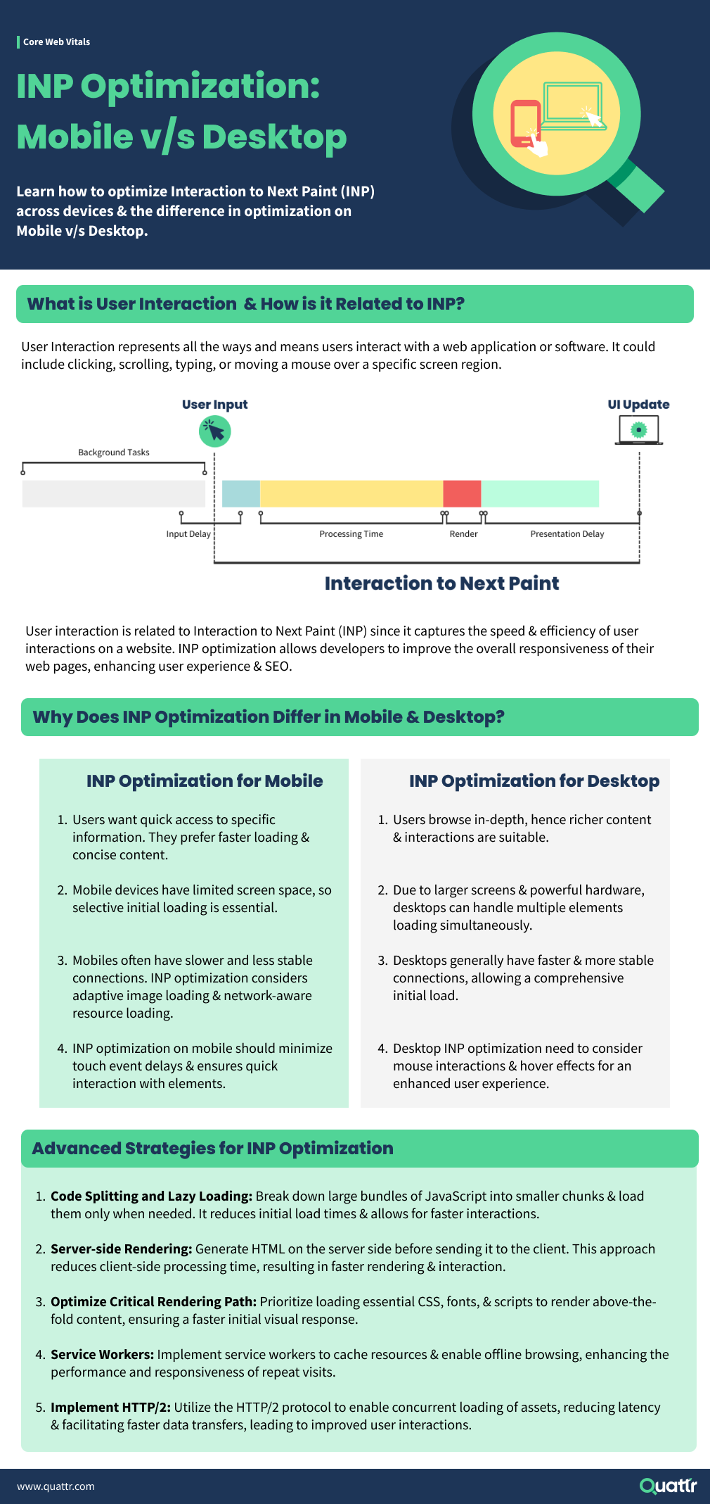
What is User Interaction & its Importance?
User Interaction is everything that happens between a user and a digital product or service. It's the direct communication between your consumers and your website or application. This includes clicking buttons, filling out forms, swiping on mobile applications, or navigating a website.
As a marketer, SEO specialist, web developer, or web admin, user interaction plays an essential role in the success of your online platforms. Imagine your website or application as a physical store. Your ultimate goal is to attract customers and ensure they have a pleasant experience so they keep coming back.
In the digital world, that experience is dictated by the ease of navigation, the website's speed, the content's relevance, and many other factors. The better these interactions, the happier your users are and the more likely they are to engage positively with your website or app, leading to higher conversions, better reviews, and more traffic.
User Interaction & SEO + UX
User interaction has a direct impact on user experience (UX). For example, if your site is easy to navigate, with clear, intuitive buttons and menus, users are more likely to have a positive experience. On the other hand, if your site is confusing or complex, users can get frustrated and leave.
So, investing time and resources into optimizing user interactions can significantly boost user satisfaction and overall user experience.
Lastly, user interaction is critical to SEO. Search engines like Google consider user behavior metrics to rank websites. If your site delivers a positive user experience, it's likely to reduce bounce rates and increase session durations.
Both metrics signal to search engines that your site is valuable to users. This, in turn, increases your site's credibility and improves its chances of ranking higher in search results. Focusing on user interaction is not just about making users happy, it's also a strategic move to boost your online visibility and reach.
User Interaction & Google
Google considers user interaction as a crucial aspect of website design and usability. From the search engine's perspective, a website that offers smooth and engaging user interactions provides a better user experience.
To improve user interaction and the page experience, Google created Interaction to Next Paint (INP) metric. It helps developers measure the time between a user's first interaction with a web page and when the page responds by updating its visual content. Using the INP metric, developers can optimize their website performance for better user interaction.
To learn more about INP, refer to our comprehensive Interaction to Next Paint guide.
User Interaction on Mobile v/s Desktop
User interaction on desktop and mobile devices can significantly vary due to the differences in screen size, input methods, and user behavior. Here is how user interaction differs on desktop and mobile:
How to Measure INP Performance on Mobile & Desktop?
Google recently introduced a significant update, replacing First Input Delay (FID) with INP in their Core Web Vitals reporting. This replacement comes into effect starting March 2024. To get wed admins acquainted with the change, Google Search Console (GSC) now provides a separate table of INP performance below the Core Web Vitals report.
Core web vitals reports are separated based on devices. The INP performance table is available for both desktop and mobile separately. To access INP reports for mobile and desktop in Google Search Console, navigate to the "Core Web Vitals" section.
Here, you can find detailed insights into your website's INP performance on both platforms, allowing you to identify areas for improvement and optimize user interactions accordingly. Read our blog on How to analyze INP reports in GSC to learn more about accessing INP reports in GSC.
The acceptable benchmarks for INP scores may vary depending on the device. Generally, lower INP scores are desirable, indicating faster page interactivity. For desktop & mobile, INP scores below 200 milliseconds are considered excellent.
How Does Interaction To Next Paint Optimization Differ For Mobile And Desktop?
INP optimization is crucial for delivering a seamless user experience on mobile & desktop platforms. However, the optimization process differs significantly between these two devices due to various factors.
What are the Common INP Issues on Mobile?
Certain common INP issues can hamper user experience on mobile. Here are some of the common issues:
1. Render-Blocking Resources: Large or unoptimized resources such as JavaScript or CSS files can cause render blocking, leading to delayed user interactions and higher INP scores.
2. Network Latency: Mobile devices often face fluctuating network conditions, causing delays in fetching resources, thereby increasing INP.
3. Unoptimized JavaScript: Poorly optimized JavaScript code can significantly impact INP performance, particularly on mobile devices with limited processing power.
4. Third-Party Scripts: Overreliance on third-party scripts and iframes can introduce additional dependencies and increase the risk of INP delays.
5. Inefficient Resource Loading: Not prioritizing critical resources can lead to incomplete rendering and hinder the speed of user interactions.
Why is my INP Score Low on Desktop?
While user interaction on desktop differs from mobile, INP scores can still face challenges even if everything seems fine on mobile. Here are some reasons for low INP scores on desktops:
1. Complex Rendering: Websites with intricate designs and heavy multimedia elements may encounter longer rendering times, affecting INP scores.
2. JavaScript Execution: Unoptimized or excessive JavaScript execution can cause delays in user interactions and contribute to lower INP performance.
3. Heavy Resource Loading: Websites with numerous large images, videos, or other resources may experience slower loading times, impacting INP.
4. Server Response Times: Sluggish server response times can increase the time it takes to process user input and reflect on the screen.
5. Lack of Prioritization: Failing to prioritize critical resources can lead to delayed rendering and suboptimal INP scores.
INP Optimization Mobile v/s Desktop: Which is Harder?
Optimizing INP for both mobile and desktop presents distinct challenges. Mobile optimization is often considered more challenging due to the following reasons:
1. Limited Resources: Mobile devices have constrained processing power and memory, demanding more meticulous resource management and optimization.
2. Variable Network Conditions: Mobile devices rely on cellular networks, which can exhibit fluctuating speeds and intermittent connectivity, making resource fetching less predictable.
3. Viewport Changes: Frequent changes in mobile screen orientation and viewport size require adaptive rendering strategies, affecting INP.
The key to successful INP optimization is recognizing the unique factors influencing user interaction on each platform & implementing targeted strategies accordingly. Addressing platform-specific hurdles allows developers to enhance the overall user experience.
Advanced Strategies for INP Optimization
The difference in strategies for INP optimization for mobile and desktop platforms is significant due to their distinctive characteristics. Let us look at advanced techniques that can substantially improve INP scores for both platforms.
Code Splitting & Lazy Loading
Large JavaScript bundles can significantly increase load times and INP, especially on mobile devices. Implementing code splitting divides your code into smaller, manageable bundles that load only when needed.
Lazy loading delays the loading of off-screen content until the user scrolls down to it. Both strategies can decrease load times, improve INP scores, and enhance user experience.
Server-side Rendering
SSR technique renders the webpage on the server rather than the browser. It can significantly reduce load times and INP as the browser downloads a fully rendered page. This technique is most effective for content-heavy websites and can improve the site's SEO, as search engines can crawl and index server-rendered content more easily.
Optimize Critical Rendering Path
The Critical Rendering Path (CRP) is the sequence of tasks the browser performs to display the website. By optimizing your CRP, particularly by minimizing the number and size of critical resources, you can significantly reduce load times and improve INP. Techniques include deferring non-critical CSS and JavaScript, inlining critical CSS, and using async and defer attributes for JS files.
Service Workers
Service workers are scripts your browser runs in the background, independent of a webpage, opening the door for features that don't need a web page or user interaction. They can cache key resources and serve them directly from the cache, bypassing the network entirely for these resources. It can significantly improve the INP score, especially under poor network.
Implement HTTP/2
HTTP/2 is a revised version of HTTP/1.1, designed to address some of its performance issues. Its features, like multiplexing, server push, and header compression, can reduce load times and improve INP. While implementation can be complex and require server-side changes, the performance benefits can be significant, particularly for mobile users.
Start Optimizing Your Websites for INP For Mobile & Desktop
Optimizing Interaction to Next Paint (INP) enhances user experience across mobile and desktop platforms. It is essential to understand the unique challenges faced on each platform and devise specific strategies accordingly. Advanced techniques like code splitting, server-side rendering, and efficient asset delivery can significantly improve INP scores.
Furthermore, adopting a different approach for mobile and desktop devices, considering user behavior, screen size, network conditions, and interaction methods, can help optimize INP. These targeted strategies don't just ensure a responsive and engaging user experience but could also potentially boost search visibility. Quattr provides a comprehensive website optimization approach and can help significantly improve your page experience metrics.
Scale INP Scores across Mobile & Desktop With Quattr!
Get StartedINP Optimization for Mobile v/s Desktop FAQs
Is INP optimization more critical for mobile or desktop?
Both mobile and desktop INP optimization are essential for delivering an exceptional user experience. However, mobile optimization demands more attention due to varying network conditions and resource constraints.
Can I use the same INP optimization techniques for both mobile and desktop?
While some INP optimization techniques may apply to mobile and desktop, it's essential to consider the differences in user behavior and device capabilities. User interactions vary between devices, and factors like screen size, touch vs. mouse input, and network conditions play a role. Tailoring specific INP optimization strategies for each platform can lead to more effective results and better user experiences.
Do INP optimization techniques impact other CWV metrics?
Yes, INP optimization techniques can impact other Core Web Vitals (CWV) metrics, such as Largest Contentful Paint (LCP) and Cumulative Layout Shift (CLS). Improving INP can lead to a more efficient loading experience, positively influencing LCP. Additionally, smooth interactions and reduced layout shifts can improve CLS scores.
How often should you optimize INP for mobile and desktop?
Optimizing INP for both mobile and desktop should be an ongoing process. Regularly monitor user interactions, page performance, and INP scores, and make adjustments whenever necessary. As website content, design, or functionality changes, reevaluate and optimize INP to ensure a seamless and responsive user experience on both device types.
About The Author

About Quattr
Quattr is an innovative and fast-growing venture-backed company based in Palo Alto, California USA. We are a Delaware corporation that has raised over $7M in venture capital. Quattr's AI-first platform evaluates like search engines to find opportunities across content, experience, and discoverability. A team of growth concierge analyze your data and recommends the top improvements to make for faster organic traffic growth. Growth-driven brands trust Quattr and are seeing sustained traffic growth.


