Quattr Leads AEO, SEO, and Content Rankings on G2 Spring 2026.
Quattr Leads AEO, SEO, and Content Rankings on G2 Spring 2026.

In today’s mobile-first world, your website’s performance on smartphones and tablets can directly impact your traffic, rankings, and conversions. If your site isn’t optimized for smaller screens, slow load times and poor usability can quickly drive visitors away. That’s why understanding How to Make a Website Mobile Friendly and Win with Mobile SEO is more important than ever.
A mobile-friendly website not only improves user experience but also aligns with search engine expectations, as Google primarily uses mobile-first indexing. In this guide, you’ll learn practical strategies to enhance usability, strengthen mobile-friendly SEO, and ensure your website delivers a seamless experience that keeps users engaged and coming back.
7.
8.
10.
Mobile friendliness means your website is built to deliver a smooth and comfortable experience on smartphones and tablets. Visitors should be able to read content clearly, navigate easily, and take action without zooming, pinching, or struggling with layout issues. A mobile friendly site removes friction and makes browsing simple.
To achieve this, use responsive design so pages automatically adjust to different screen sizes. Ensure text is easy to read, buttons are large enough to tap comfortably, and navigation is clean and simple. Optimize images and reduce unnecessary code to improve loading speed. When your site works seamlessly on mobile devices, users stay longer, engage more, and are more likely to convert.
Mobile friendliness matters because most people now browse, search, and shop on their phones. If your website is difficult to use on a small screen, visitors leave quickly and may never return. A smooth mobile experience keeps users engaged and makes it easier for them to explore your content or take action. Here are some key elements of mobile website SEO.
Most people browse on mobile devices, so your website must be easy to read and navigate on smaller screens. A smooth mobile experience keeps visitors engaged and reduces bounce rates.
Search engines evaluate the mobile version of your site for indexing and ranking, a shift often discussed alongside the differences in mobile vs desktop SEO. Poor mobile performance can lower visibility, while optimized pages support better SEO results.
Fast loading pages, simple navigation, and tap friendly buttons make it easier for users to complete actions. A professional mobile experience builds credibility and increases conversions.
A mobile-friendly website is designed to deliver a smooth and seamless experience on smartphones and tablets. A truly mobile optimized website adapts to smaller screens, loads quickly, and lets users browse, navigate, and complete actions without friction. Strong mobile friendly SEO ensures both users and search engines can easily access and understand your content on mobile devices.
There are three main ways to build a mobile-friendly website as part of mobile website SEO:
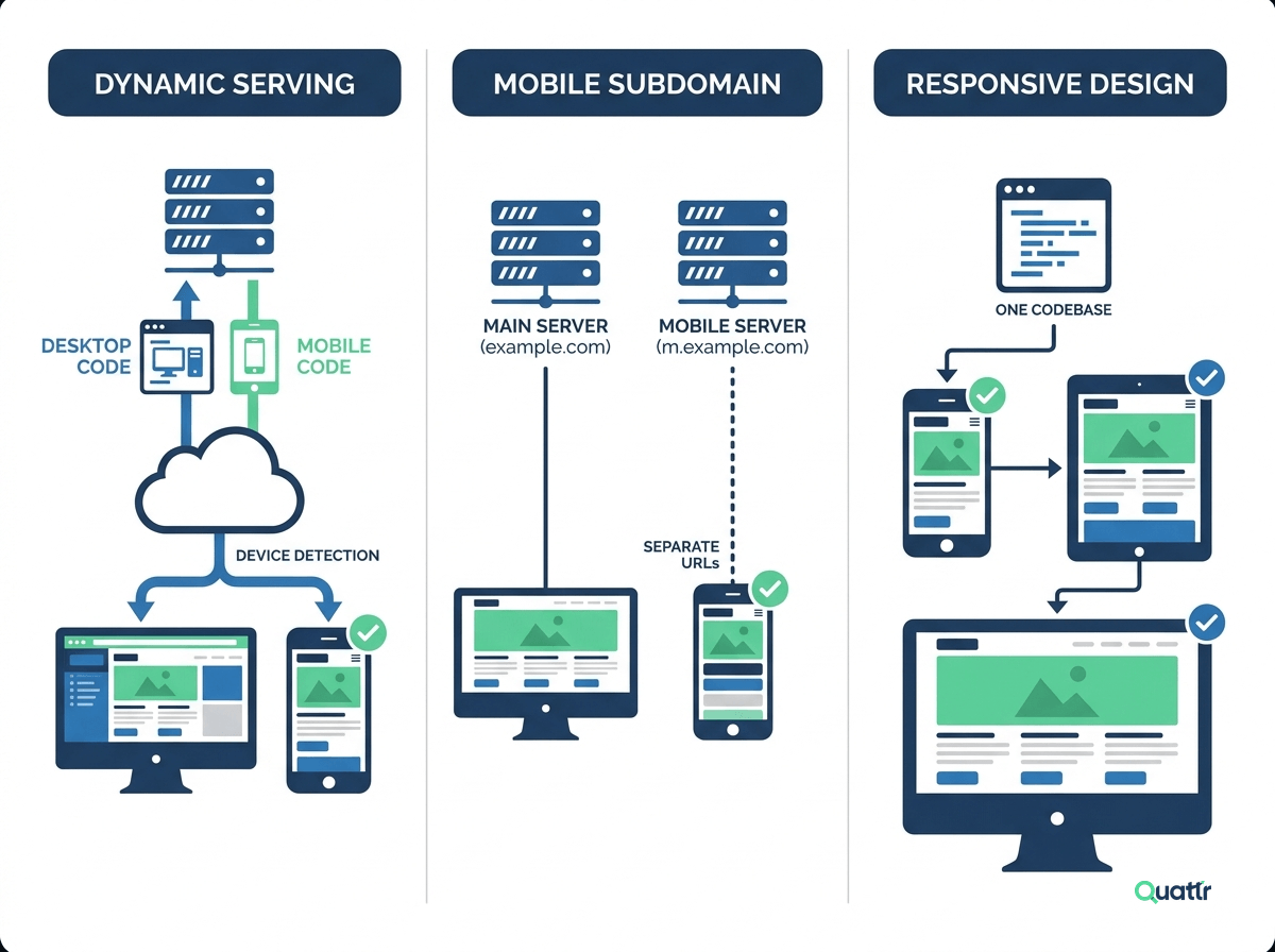
This setup detects the user’s device and serves different HTML for mobile and desktop users. While it can support mobile optimisation, it requires careful technical configuration, including correct headers, to avoid indexing and caching issues.
This approach uses a separate mobile site on a subdomain like m.example.com. Although usable, it adds complexity, increases maintenance effort, and is generally no longer recommended for modern mobile website SEO strategies.
Responsive design automatically adjusts layout and content based on screen size using a single codebase. It is the most efficient option for responsive SEO and directly supports stronger Core Web Vitals through mobile responsiveness, and is widely considered best practice for long-term mobile optimisation.
<meta name="viewport" content="width=device-width, initial-scale=1.0" />
Getting the technical setup right is only half the job, how that setup actually feels to a real visitor on their phone is what determines whether they stay or leave.
Mobile users are often goal-driven and impatient, which is why clear layouts and fast access to information matter. Applying practical mobile SEO tips like readable text, simple navigation, and touch-friendly buttons helps reduce friction and improve engagement. Avoid outdated technologies, keep content concise, and design pages vertically so users can move through them naturally.
Performance plays a major role in mobile friendly SEO. Slow pages increase abandonment and hurt visibility. Optimizing images, reducing scripts, and improving server response times are essential mobile page speed tips that improve load speed. A fast, responsive, and well-structured site strengthens mobile optimisation and supports stronger search performance overall.

Understanding the difference between responsive design and a mobile-friendly website is important because the two are often confused, yet they impact usability, SEO, and maintenance in different ways. Choosing the right approach affects how users experience your site and how easily search engines can crawl and rank it.
A mobile-friendly website simply means a site that works on mobile devices. It may involve a separate mobile version, dynamic serving, or basic adjustments to make content readable and clickable on smaller screens. While it improves usability on phones, it can require extra development effort and ongoing maintenance.
Responsive design is a specific method of building a mobile-friendly website. It uses a single codebase that automatically adjusts layout, images, and content based on screen size. This creates a consistent experience across devices and is the approach most search engines recommend.
Not all mobile-friendly sites are responsive, but all responsive sites are mobile-friendly. Understanding this helps you make better decisions for SEO, performance, and scalability. Responsive design is usually more efficient, easier to manage, and better aligned with modern mobile SEO best practices.
A search engine's view of a mobile website differs significantly from a desktop site. It is mainly due to the differences in how users interact with a website on a desktop instead of a mobile device.
On a desktop, a user can easily view a website in its entirety, with all of its content, images, and videos. On a mobile device, this is not always the case.
Thus, search engines consider how the website is optimized for a mobile user when indexing it. It includes loading speed, page layout, and page structure, all of which tie back to Core Web Vitals performance at scale.
For example, a website optimized for mobile often displays its content in a single-column layout to improve readability. It will also place the most relevant content near the top of the page so that mobile users can easily find what they want.
Additionally, a mobile friendly website will consider the size of a mobile device's screen when displaying content, images, and videos. It means that a mobile friendly website will be designed to make the important content visible without the user having to zoom in or scroll around a page.
Google prioritizes the mobile version of your website when crawling and ranking pages. This means search engines evaluate how your site performs on smartphones before considering the desktop experience. If your mobile pages are slow to load, difficult to navigate, poorly structured, or missing important content, your rankings can suffer even if your desktop version works perfectly.
Mobile performance directly affects user experience signals such as bounce rate, engagement, and time on site. When users struggle with speed or usability, they leave quickly, sending negative signals to search engines. A responsive design helps ensure consistent content, structure, and performance across devices, making it easier for Google to crawl, index, and trust your website. By focusing on mobile SEO and user experience, you align your site with how both users and search engines interact with the modern web.
Many mobile-friendly testing tools help you check if your website is mobile-friendly. Some of the most popular ones include Google's Mobile-Friendly Test, MOZ's Sprout, and W3's Mobile-Friendly Test. In most cases, you will be able to find the result instantly. If your website fails to meet the criteria, you can start working to make your web page mobile friendly.
Let us look at how to test your website with Google's Mobile-Friendly Test. To use this tool, visit Google's Mobile-Friendly Test website and enter the URL of your website. Alternatively, you can also join the code snippet of your web page and test the same for mobile-friendliness. Hover over to the 'code' section for the same.

The tool will analyze your website and determine if it is mobile-friendly. If it is not, then the device will recommend steps to optimize your website for mobile.
Some top reasons websites fail the mobile-friendly test include the following:
1. Using Incompatible Plugins: Plugins not designed to be mobile-friendly, such as Flash and Silverlight, can cause pages to fail mobile-friendly tests. It is because they are not supported on mobile devices or not optimized for a mobile experience.
2. Viewport Not Set: The viewport is a meta tag that helps websites adjust to the dimensions of different devices. If a viewport is not set, the website will not automatically adjust to the device's size, leading to a failed test. Many mobile-friendly tests require that the viewport be set to "device-width" for the website to adjust to the device properly.
3. Content Wider Than Screen: If the website's content is wider than the device's screen, it can be challenging to read and navigate. Thus it will affect the user experience, and Google might fail your website for mobile-friendly tests.
4. Text Too Small to Read: Your website might fail the mobile-friendly test if the text is too small to read; it can be challenging to comprehend the page's content.
5. Clickable Elements Too Close Together: If clickable elements are too close, it can be difficult to accurately click on a desired button, leading to a failed test.
6. Blocking CSS or JavaScript Resources: The problem with blocking images, CSS, and JavaScript resources from search engine bots is that the search engines need these elements to render a mobile site correctly. Blocking them means the search engine cannot accurately see how the site would look on a mobile device. It means that a site is less likely to pass a mobile friendly test because the search engine bots cannot accurately render the page.
7. The website uses too much Flash or JavaScript: Some websites use too much Flash or JavaScript, making them difficult to view or use on mobile devices.
All these issues are fixable. Some ways in which you can optimize your website for mobile-friendliness include:
1. Make your website responsive to adjust to the device's screen size.
2. Minimize the use of Flash and JavaScript.
3. There is a need to increase the font size on your website.
Let's now learn how to make a mobile-friendly webpage now that we know what a mobile, responsive website is. We will also discuss why it is so significant from an SEO standpoint.
If your site does not pass the mobile-friendly test, you have two options to make a mobile version of your website. One way is to create a separate mobile website. Another way is to create a responsive design for your website. With a responsive design, your website will automatically adjust to the device's screen size.
To create a separate mobile website, you must create an independent website designed explicitly for mobile devices. You will need to create a different layout and design for the mobile website, and you will need to create separate pages for mobile devices. The mobile website should be accessible from all mobile devices, and the pages should be easy to navigate.
You must create a style sheet to create a responsive design for your website. The style sheet will tell how your website adjusts to the size of the device screen. You will need to create a separate style sheet for mobile devices, and you will need to make sure that it links to the style sheet on your website. The style sheet should be easy to access, and it should be compatible with all mobile devices.

A responsive layout is the most popular way to design a mobile website. Responsive design will automatically adjust the layout and size of the website to fit the device screen size. It's made using a combination of HTML, CSS, and JavaScript.
Google announced that mobile-friendly websites would rank better in search engine results pages, so having a mobile-friendly website boosts a website's SEO value. Google prefers indexing and ranking websites that have mobile adaptive websites. If you do not have one, you negatively affect your SERP rankings.
You can use a mobile website template if you don't want to create a responsive design for your website. Templates are pre-made responsive designs that you can use for your website. Many templates are available, and most are free to use.
When designing a website for mobile users, it is essential to remember that mobile phones display content in both Landscape and Portrait orientations. Therefore, ensuring the website looks and functions properly in both orientations is imperative, without any UI distortion or glitches. It can be easily checked by testing the website on real devices. Ensuring the website is optimized correctly for both orientations may require extra effort on the developer's part. However, it is worth it for a better experience for mobile users.
Most web users conduct searches on mobile devices, as we established previously. According to Google's mobile search behavior study, 53% of visitors abandon a mobile-friendly website layout if it takes over three seconds to load.
While page speed optimization efforts are essential site-wide, the above statistic highlights how crucial it is to provide a good page speed for all mobile-friendly layouts.
Page speed is a critical factor for website rankings, and optimizing your website for mobile can be a great way to improve your page speed. To increase your website's page speed, you can minimize images, use caching, and optimize your code.
Please read our page speed optimization guide to know more.
Another mobile-friendly approach to making your website responsive is simplifying the design and layout. Mobile users will navigate the website more easily. You can do this by reducing the clutter on the page, avoiding large chunks of text, and reducing image sizes.
Users typically look for quick answers on mobile, so your website copy should be short and sweet. The faster users find the information they are looking for, the more likely they will stay on your website.
Another way to make your website more mobile responsive is to use fonts that are easy to read on mobile devices. You can do this by using big and easy-to-read fonts and avoiding using ones that are difficult to read on small screens.
Another way to convert your site to mobile, improve website speed, and make it mobile-friendly is by using small image sizes and compressed CSS files. Small images help reduce your website's file size, improving page speed on mobile devices.
Images should be lazy-loaded and have small file sizes. It becomes even more important on mobile as users are typically on slower network connections and smaller screen sizes.
You can use TinyPNG and CSS Compressor to compress images and CSS files.
Users increasingly watch videos on their mobile devices. In fact, according to a study by Cisco, video traffic will account for 80% of all global internet traffic by 2019. Hence, you need to optimize your videos for mobile devices.
You can do this using a tool like JW Player's video player for mobile. It will automatically optimize your videos for all mobile devices, including iOS and Android. It will adjust the video layout to fit the screen size and use optimal compression.
Another critical aspect of making your website mobile-friendly is to make the website navigation easy to use on mobile devices.
Mobile menu navigation should be cleaner and simple than desktop or tablet since the screen size is small. A user should have ample space to click on a button or between different parts of the website.
You do not want users clicking by mistake or feeling frustrated because they can't find information. Some mobile website best practices to remember for mobile adaptive website menu navigation are:
1. Use drop-down menus instead of nested menus
2. Place frequently used menu items at the top of the menu
3. Use clear labels for menu items
4. Keep menu items short and to the point
Using Flash will cause a poor user experience. It's common to use Flash to create animations. However, it is ideal o avoid Flash since mobile devices rarely support it.
Similarly, too many pop-ups on a website can overwhelm and annoy users on mobile devices. Before users even see your website, pop-ups can make them leave.
Users shouldn't encounter sudden pop-ups when browsing web content, especially on mobile devices. The X mark (to close the pop-up) is sometimes not even visible, adding to the users' frustration.
Designers and developers should display advertising subtly. An irrelevant pop-up can turn your prospects into irate customers, resulting in lower mobile conversions.
The viewport meta tag is added to the head section and will tell mobile devices how to display the website.
If you are not using a responsive design, you can add the viewport meta tag to tell mobile devices how to display the website, making it easier to navigate and view on mobile devices.
You can use the code to define each web page's meta elements:
<meta name="viewport" content="width=device-width, initial-scale=1.0">
Optimizing button sizing and placement for mobile websites will make it easier for users to navigate. You can do this by making the buttons bigger and placing them in an easy-to-access location.
The buttons on your website should be big enough to be easily accessible and clickable on mobile devices. The options are on a page or in the sidebar.
For link placement, space them out. Avoid placing links close to each other or immediately after each other.
When filling up forms, people hate to type on a small screen. In fact, according to research, 81% of people would instead use a touch screen then type on a small screen. It is, thus, vital to optimize your forms for mobile devices. So with forms, shorten them and only ask what you need.
Long forms on mobile create a long scroll and frustrate users. They may abandon your page, and you will miss the chance to capture a lead. People are impatient and would want to fill in the shortest form and hit submit. So keep the form short and sweet and only ask for essential information.
Having a mobile-friendly website is critical in digital marketing. Having a website with excellent content and design is no longer enough. A well-designed mobile website is essential. Mobile responsive websites are not just preferred by users but also by search engines.
The best way to ensure your website is mobile adaptive is to test it regularly on different mobile devices. By testing frequently, you can identify areas for improvement and make changes accordingly. You can use various tools to test your website on mobile devices, such as the Google Mobile-Friendly Test.
The Quattr platform can also help you optimize your website to be mobile-friendly. The tool is handy for domains with millions of websites where it is even more critical to have mobile responsive pages rank on SERPs. Quattr tests your entire domain for mobile UX design errors within the usability recommendations. We prioritize our recommendations based on the number of clicks a page receives so that you know which pages to prioritize for mobile optimization.

You should also keep track of the latest mobile trends and changes to optimize your website for mobile devices. Technology and user behavior are constantly evolving, so you need to be adaptable to keep up.
Mobile-friendly website SEO is a set of strategies used to optimize a website to be indexed and ranked correctly by search engines, making it easier for users to access content on mobile devices. It includes using a mobile-friendly site design, optimizing content for faster loading on mobile devices, implementing meta tags and page titles optimized for mobile search, and using an HTTPS connection for secure data transmission.
You can test your website using Google's Mobile-Friendly Test tool to see if it is mobile-friendly. This tool checks the page loading speed and sizes of the page elements, as well as other factors, such as the use of text instead of images and the presence of viewport meta tags, to assess the overall mobile-friendliness of a website.
To make a website mobile-friendly, use responsive web design and optimize page loading speed by reducing image sizes, using compressed files, and caching resources. Optimize meta tags, page titles, and content for mobile search, use structured data, and improve core web vital scores. Lastly, optimize the website for voice search and ensure the content is compatible with all screen sizes.

Quattr is an AI-native Search Visibility Platform founded in Palo Alto, California, built for mid-market and enterprise brands competing in the age of generative search. Recently recognized across G2’s Spring 2026 reports with #1 rankings in AEO Results, Usability, and Relationship, Quattr helps brands win visibility across traditional search and AI-generated answer surfaces.
Quattr’s AI agent, GIGA, evaluates content the way AI systems do, identifying gaps across structure, authority, internal linking, and discoverability to surface the highest-impact fixes. With capabilities like autonomous internal linking, E-E-A-T intelligence, and the new GIGA Landing Page Generator for keyword-matched, AI-search-ready pages, Quattr helps teams move from diagnosis to deployed changes without manual bottlenecks.


Try our growth engine for free with a test drive.
Our AI SEO platform will analyze your website and provide you with insights on the top opportunities for your site across content, experience, and discoverability metrics that are actionable and personalized to your brand.

.svg)
.svg)


