Quattr Leads AEO, SEO, and Content Rankings on G2 Spring 2026.
Quattr Leads AEO, SEO, and Content Rankings on G2 Spring 2026.
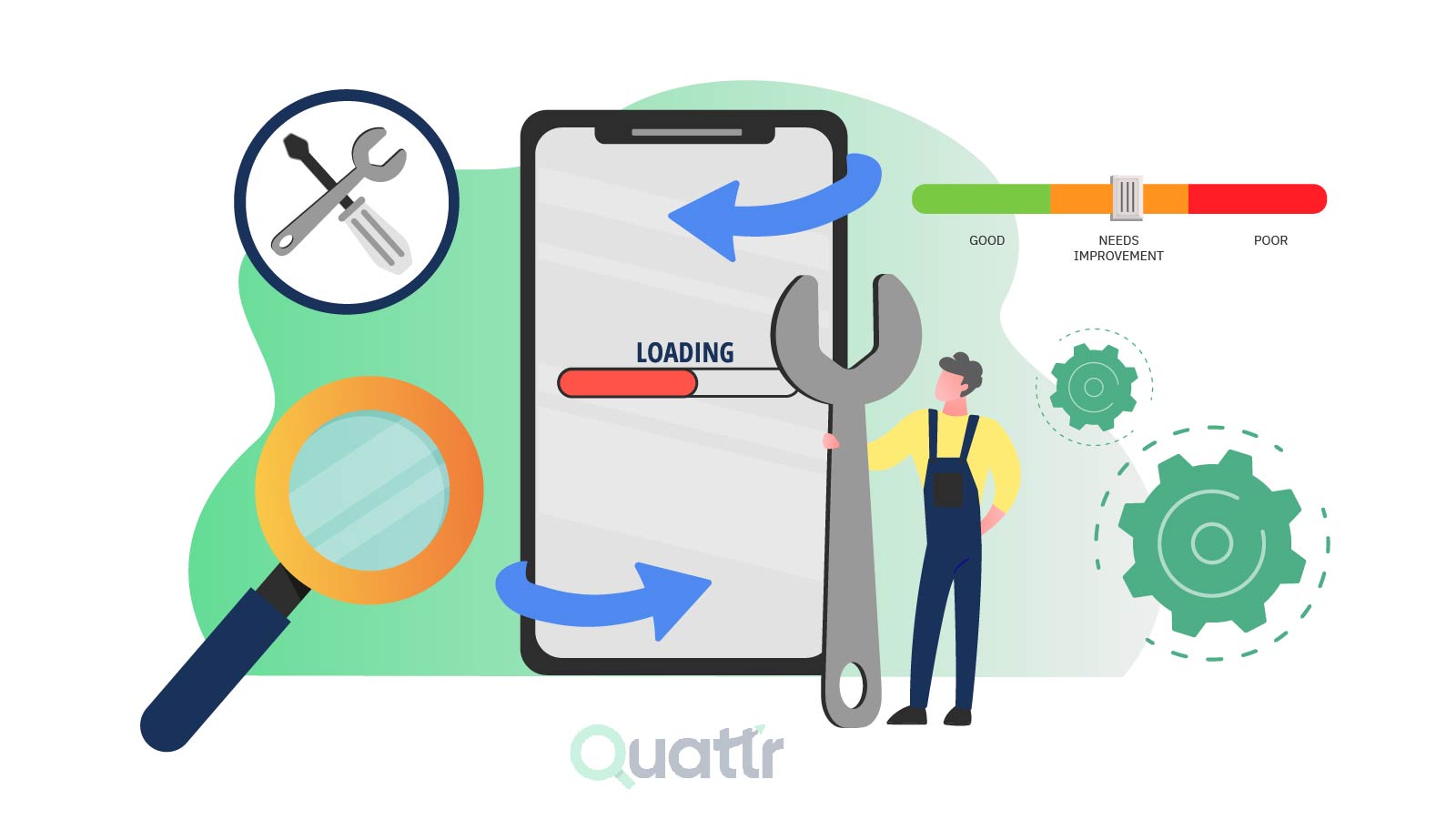
Today, Google uses mobile-first indexing, which means your website’s mobile version plays a key role in how it ranks in search results. If your site isn’t fast and easy to use on mobile, you risk losing both visibility and users. A smooth, responsive mobile experience keeps visitors engaged and reduces drop-offs. Improving mobile page speed can directly boost your rankings and help you drive more organic traffic.
This blog will cover optimizing your web pages for mobile page speed scores. Learn how a fast-loading mobile website will improve user experience on SERPs & maximize organic traffic performance.
Google evaluates your site based on real mobile user experience, not just design, things like tap delays, layout shifts, and load time matter.
If your mobile version hides content or links, that content may not count for rankings at all.
Internal linking often breaks on mobile (menus, accordions), which can weaken crawl paths and page authority.
Heavy scripts and third-party tools slow mobile pages, so performance optimization is more about removing than adding.
Faster mobile pages don’t just rank better, they also improve conversion rates and user retention significantly.
6.
7.
8.
9.
10.
Mobile page speed refers to how quickly your content loads when someone views a web page on a mobile device. Mobile page speed optimization is optimizing the loading time of a webpage when accessed on a mobile device. It can help improve user experience, increase search engine rankings, and reduce bounce rates.
Mobile page speed can be affected by several factors:
1. The number of images, videos, and other media assets on the page
2. The number of HTTP requests
3. Server-side scripting and coding for your website
4. Hosting service provider, server location, and content management systems (CMS)
5. Use of cache technology and minification
These aspects affect your page loading speed and your website's user experience.
Let's examine why a faster-loading mobile website is essential:
Affects Your Search Ranking: A faster-loading mobile website is critical for search engine rankings. Google began prioritizing all search results based on the mobile-friendliness of their pages.
Impacts Bounce Rate: A study by Google found that when page load time grows from 1s to 3s, the risk of bounce increases by 32%, or 90% if it climbs from 1s to 5s. The faster the site loads, the lower the bounce rate. Having a faster mobile website will help you reduce the bounce rate.
Affects Conversion Rates: According to Google, conversions might drop by up to 20% for every second delay in mobile page load. Additionally, users will likely only abandon a website if the page takes up to three seconds to load.
Therefore, optimizing a website's mobile page speed can ensure that users' dwell time increases, resulting in a higher conversion rate.
Google greatly rewards websites with a positive mobile experience, including fast page loading speeds. Sites that load quickly on mobile devices are highly rated in Google’s algorithm and tend to rank higher in search engine results.
Google considers page speed as a ranking factor, especially on mobile devices.
Google has released several algorithm updates prioritizing faster-loading webpages on mobile devices.
1. Mobile-Friendly Update: In 2015, Google introduced a new algorithm emphasizing the mobile user experience as an essential signal, indicating the expanding use of mobile as part of the consumer search process.
Google clarified that this upgrade would favor mobile-friendly websites in SERPs. Their emphasis is on mobile content and the mobile site experience of consumers.
2. Mobile Page Speed Update: The July 2018 update changed how Google ranks mobile webpages by shifting its focus to page speed.
3. Mobile-First Indexing Update: In 2018, Google introduced another algorithm update called Mobile-first indexing. The Mobile-First Indexing upgrade meant that Google would index and rank websites based on their mobile versions.
Once again, the goal was to improve the user experience and assist users in finding what they were searching for.
4. Core Web Vitals Update: The Core Web Vitals update early in 2021 has emphasized page speed for mobile and desktop users.
To summarize, Google may reduce the visibility of sites with slow page loads to give users a better browsing experience. Businesses must ensure their website is optimized for mobile page speed to stay competitive in search engine rankings.
Desktop and mobile websites provide optimized viewing experiences for their respective platforms. There are various reasons why the same web page will show different performance metrics on mobile and desktop.
It generally takes longer for mobile websites to load content than desktop websites. Page loading is one of the most significant factors that ultimately impact the performance score for both platforms.
Loading speeds are affected by two factors:
1. Differences in Processors
Mobile processors have an efficiency-first approach, followed by performance. Mobile devices have a lesser CPU architecture than desktop computers. That is, they are less potent in terms of processing speed.
2. Different Network Speeds
Mobile devices usually run on 3G, 4G, LTE, or Wi-Fi networks. These networks often have slower speeds than what is available to desktop devices. Network latency is the time taken for data to transfer to the network. Mobile networks typically have higher network latency than desktop networks.
Desktop websites have larger screens and take advantage of larger resolutions. Mobile websites must be optimized for a much smaller screen size, making fitting all the same information difficult.
Screen size affects mobile website performance by using less data than desktop. Navigation also significantly contributes to the performance difference between the two devices.
Navigating a desktop website with a mouse or keyboard is much easier than navigating a mobile website with a touchscreen. It makes it easier for users to find information on the desktop website, which differs from a mobile website.
Desktop websites are more interactive and complex, while mobile websites are simple and easy to use.
Instability in layout or design can harm mobile users, especially if they are not anticipating it. More sliders and animations may slow down pages and impact SEO and conversion rates.
In the event of an abrupt layout shift, Google will punish your site with a low CLS (Cumulative Layout Shift) score. This Core Web Essential will have an influence on your overall user experience score as well as your SEO visibility and traffic.
Similarly, adding new plugins for interactivity can slow down your mobile site. Using too many of them might result in security breaches and poor performance.
Plugins might cause your site to slow down by generating additional HTTP requests and adding DB queries. Some plugins require a specific style or scripting, which results in other JavaScript and CSS files on the page.
Content is generally more condensed on mobile websites, as much less space is available than on desktop websites. It can result in important content not being included in the mobile design and thus causing a difference in performance score.
Websites frequently contain graphics and videos to complement the content. Pictures can take a long time to load if caching is not enabled. Caching will make these items available immediately, so you won't have to wait when revisiting the website in the future, saving you time on slower connections or mobile devices.
Pictures are frequently the reason for slowing down your mobile site. They must be designed particularly for mobile devices. Images must be appropriately scaled down to make material readable on tiny displays.
Multiple reasons can slow down your mobile website and affect your page speed for mobile pages. But you can overcome all of them by following certain best practices.
Creating a fast-loading website is essential for any business that wants to provide customers with a great user experience. Through the best mobile page speed optimization practices, companies can ensure that their web content is optimized for SEO and loads quickly on mobile devices.
Below we discuss the most critical strategies to maximize mobile page speed:

Properly optimized images are essential for maintaining a fast mobile website. To reduce page loading times, it is necessary to ensure image optimization for size, format, and src attributes.
Start cropping your images to the correct size before uploading them, such as 1200 x 1200 pixels for both retina and regular displays. JPEG and WebP is the best image format, while you should avoid GIFs and TIFF formats.
Finally, check if there are any empty <img src=’…’> codes on your site and remove them. Image optimization won’t only speed up your website and improve user experience, but it will help conserve server resources and reduce your customers’ overall bandwidth usage.
Visit our guide on Optimize Images for Web & SEO to learn more about how optimizing images for your website can help you boost your SEO score.
Besides optimizing images, it is also essential to compress other page elements. Enabling Gzip compression is an effective way to speed up your website. It compresses large files and reduces their size, allowing them to load quickly on your site.
A Content Delivery Network (CDN), sometimes known as a 'content distribution network,' is a network of computers that can aid in the speed of page loading. It accomplishes this by hosting and distributing static content copies from servers worldwide.
Apart from the server that serves your main website, you may use a CDN to distribute copies of your site's files across many data centers. It can improve performance by shortening the distance data requests must travel between browsers and your host's servers.
A CDN reduces network latency and produces reduced TTFBs by loading content for a web page from a server close to each visitor. CDN is especially beneficial for mobile websites, as users often have less bandwidth and slower connection speeds than those accessing the website from a desktop. Using a CDN allows mobile users to experience a faster, smoother, and more enjoyable website experience.
If you are a website owner, allowing web browser caching can be your secret weapon for a reduced waiting time. Browser caching is a simple but effective way to save valuable files – such as images, scripts, stylesheets, and other resources – to the user’s device. It saves time, so content does not need to be re-downloaded whenever a user visits your website.
Browser caching can help optimize the page speed of a mobile website by storing commonly used web elements such as images, stylesheets, and scripts on the user's device.
Caching reduces the time and data required to download these elements, resulting in a faster page-loading experience. Additionally, browser caching can reduce the number of requests from the server, ultimately improving page speed.
Moreover, with browser caching, you won't need to worry about overloading your server with many requests. Caching ensures that the content is already on the user's device. It will keep your website running smoothly, even during high traffic.
HTTP requests are one of the most significant detractors of site performance. A request occurs when a browser requests HTML or CSS files from a server. As a result, the more on-page components you have on your website page, such as images, scripts, flash, or stylesheets, the more requests to perform and the longer the load time.
You can reduce the amount of HTTP requests by considering the following guidelines.
1. Streamlining the number of elements on your page
2. Using CSS instead of images
3. Combining multiple styles of sheets into a single one
4. Keeping scripts at the bottom of the page or eliminating them
5. Combining images into a CSS sprite sheet
Too many redirects can also slow down your mobile page speed. For these reasons, it is best to keep redirects to a minimum. Even according to Google guidelines, web admins should minimize or eliminate redirects.
Learn different types of redirects by reading our guide on URL Redirection.
Web admins must consider minifying their HTML, CSS, and JavaScript files. It could lead to a significant increase in the loading speed of your mobile site.
To minimize your code, you should remove all unwanted and unnecessary text the browser does not need. It is to reduce the code to a smaller size and make it easier to read.
Next, look at your JavaScript files and remove any extra files or scripts. Finally, remove all the additional spaces and line breaks using manual or automated tools.
The speed of a website on mobile also relies on a large, heavy-duty technological device called a web server. It implies that the longer your server waits for data from your consumers' browsers, the slower your website will be. The causes range from delayed database searches to memory depletion.
A slow server response time can lead to a sluggish website, and it's essential to try to get it under 200ms. To do this, you should analyze the current performance and look for any bottlenecks.
You can do multiple optimizations to reduce your server response time. First, consider changing your web server software or configuring it better. It can help improve the speed of the server. Next, reduce the resources your web pages require, which could be achieved through code optimization, eliminating unnecessary plugins, or optimizing image sizes.
Developers must eliminate scripts and stylesheets that interfere with loading above-the-fold content. You can improve your overall site speed by removing slow-loading scripts and stylesheets, likely leading to a perfect Google Page Speed Insights score.
Eliminating scripts and stylesheets is an easy process:
1. Check your website for unnecessary scripts or stylesheets that could slow loading times.
2. If you find any unnecessary scripts or stylesheets, delete or deactivate them.
3. Recheck your website’s speed to ensure the above-the-fold content loads quickly and efficiently.
Following these steps will make you stay compliant with Google’s requirements, score high on Google Page Speed Insights, and, ultimately, improve the user experience of your website.
To improve the speed of your website, it is essential to look at the list of plugins you have enabled in your browser. While all plugins can be beneficial, having too many can hurt your website speed.
Consider disabling any plugins you no longer need to increase your website's speed. Removing these plugins can significantly decrease the PHP load time and boost your website.
Google has a range of free tools to help web developers measure and improve the performance of their mobile websites. These tools allow developers to benchmark their mobile sites against competitors and track their performance over time.
With these tools, web developers can quickly identify and address any potential performance issues on their mobile sites to ensure they are optimized for speed and offer a fast, quality user experience.
1. Google Mobile-Friendly Test
The Google Mobile-Friendly Test Tool is an online resource developed by Google to help website owners and developers evaluate the mobile-friendliness of their websites.
The tool delivers quick feedback about the design and usability of a website for users on mobile devices. It is free and is accessible from Google's webmaster tools website.

Steps to Access the Google Mobile-Friendly Test Tool:
1. Visit the Google Mobile-Friendly Test website
2. Enter the URL (web address) of the website you want to test in the input field.
3. Click on the “Test Now” button.
4. Wait a few seconds while the tool loads the page.
5. The test results will be displayed once it finishes loading the page.
The tool will provide insight into your web page that Google considers mobile-friendly. It will also tell you which page elements need to be mobile-friendly, such as images that are too large, text that is too small, or links that are too close together. In addition, the tool will provide suggestions to improve the usability of your website on mobile devices.
2. Google Page Speed Insights
Google Page Speed Insights is a famous website performance assessment tool that assigns a score from 0 to 100 to your site's speed. The higher the PSI score, the better the performance of your website. To access the page speed insights report, visit the test link, enter the URL, and press analyze.
Google Page Speed Insights can produce tests for your desktop and mobile website to account for mobile traffic based on lab and field data (real-world data). The most significant part is that the tool recommends improving your mobile site's performance.

Finally, Page Speed Insights compares your website to Google's core web vitals, breaking down how long it takes to reach each stage of the page-loading process. Core web vitals provide a more detailed knowledge of how your website loads.
Please read our detailed guide on Google Page Speed Index & Page Speed Insights to learn more.
3. Google Lighthouse
Google Lighthouse is a free tool for optimizing website speed. Because it is open-source software, anybody can use it on any website.
The tool evaluates your website's accessibility and SEO, emphasizing core web vitals based on lab data (controlled environment). Lighthouse gives you more flexible options, such as setting up connection speed and limit, while getting the report.

You can access the lighthouse report using four methods:
1. Chrome DevTools
2. Command-line Interface
3. Lighthouse API
4. Chrome Extension
Learn more about Google Lighthouse by reading our guide on Google Lighthouse Optimization.
Remember that website performance is an important consideration, especially for mobile visitors. Making websites mobile-friendly will improve user experience and increase exposure and ranks on Google searches. As a result, while calibrating websites for mobile devices, development and testing teams must take website performance in mind.
Web developers must guarantee that their websites have a responsive design that lets websites adjust to multiple screen widths without interfering with the visual experience.
Besides, teams must include fundamental strategies such as caching, compression, image optimizations, and more to increase site speed for mobile and desktop platforms.
You can speed up your mobile website load time in many ways. You can minify your CSS, JavaScript, and HTML resources, eliminate unnecessary plugins, minimize the web server response time, enable browser caching, etc.
The ideal loading time of your mobile website is 1-2 seconds. If the mobile page load time is 3 seconds at maximum, then the user will abandon your page, which leads to an increase in bounce rate and loss of a potential customer.
Your mobile site speed is slower than desktop because of various factors. These factors are processor variations, network speed, unoptimized images for mobile websites, high graphics animations, etc.
Mobile-First Indexing and AMP (Accelerated Mobile Pages) enhance the experience of mobile users. While AMP is a framework used to create fast-loading, optimized websites, Mobile First Indexing is the process of indexing web pages based on the mobile version of the content. The two approaches are related but different.

Quattr is an AI-native Search Visibility Platform founded in Palo Alto, California, built for mid-market and enterprise brands competing in the age of generative search. Recently recognized across G2’s Spring 2026 reports with #1 rankings in AEO Results, Usability, and Relationship, Quattr helps brands win visibility across traditional search and AI-generated answer surfaces.
Quattr’s AI agent, GIGA, evaluates content the way AI systems do, identifying gaps across structure, authority, internal linking, and discoverability to surface the highest-impact fixes. With capabilities like autonomous internal linking, E-E-A-T intelligence, and the new GIGA Landing Page Generator for keyword-matched, AI-search-ready pages, Quattr helps teams move from diagnosis to deployed changes without manual bottlenecks.


Try our growth engine for free with a test drive.
Our AI SEO platform will analyze your website and provide you with insights on the top opportunities for your site across content, experience, and discoverability metrics that are actionable and personalized to your brand.

.svg)
.svg)


