
Reporting
How to chart any cross-query result
chart-composer a saved expert workflow your assistant follows, in Claude, ChatGPT or Cursor
Turn any prior result rows into the right native chart, pick the mark and render_analysis component so the answer stays a real Quattr card, never hand-rolled HTML or a markdown table.
Try it
chart this
Private beta Part of the quattr-ai-search plugin, rolling out org by org. Request access ↗
Say any of these
chart thisvisualize thatmake a graph of itplot these numbersturn that into a chartshow it as a bar chartcan you graph the trend
You never name the skill or a tool, the assistant routes on what you asked. These are the phrasings it recognises for this one.
And when it stays out of the way
Not for running a new analysis (the domain skills do that and render their own cards), or when you want raw numbers.
Use it instead of re-running an analysis when the DATA already exists and only its visual is wanted; the domain skills render their own results, this composes a chart from rows you already have.
What it runs
build_chart_specrender_analysis
2 governed analyses, composed and scoped for you. Named here for transparency, not because you have to ask for them.
The numbers behind it
Reports these numbers feed
What it refuses to do
- Never claim a rendering that didn't happen. If only build_chart_spec ran, say a spec was produced (host-rendered), not that "a chart is shown above". Describe exactly what the tools returned.
- Never hand-roll HTML, SVG or a markdown table AS the deliverable, render_analysis is the native artifact; a markdown table pasted in chat is the anti-pattern this skill exists to prevent.
- The chart inherits the source data's labels: modeled stays modeled, estimated stays estimated, a correlation's caveat rides along, a prettier picture never launders a hedge.
- If asked to chart something the data can't honestly support (a trend from two points, a share that doesn't sum), say so instead of drawing it.
What the answer looks like
Can you graph the trend?
Analysis plan, every step, resolved for you
- Routed to the governed workflow
chart-composer - Dates bound explicitly
Jun 7 to Aug 1, 2026 - 2 analyses queued in parallel
build_chart_spec · render_analysis - Honesty gates armed
scope echo · freshness
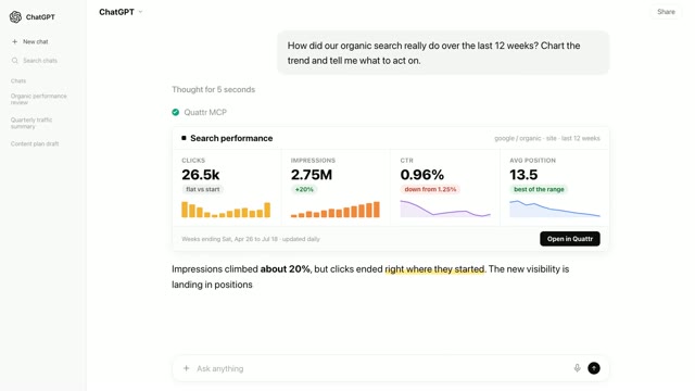
Eight weeks of clicks, rendered as a native Quattr line card, chrome and caveats intact.
- Chart
- line · 8 weekly points mark picked from the data shape, not a default
- Rendered as
- native Quattr card never hand-rolled HTML or a markdown table
- Carried over
- scope · freshness · observational the honesty chrome travels with the visual
Jun 7 to Aug 1, 2026
⚠ Observationalas of Aug 2, 2026IllustrativeOpen in Quattr ↗
Same rows, right mark, no re-query, no re-typing.
A simulated conversation on fictional data. Scope, freshness and the ⚠ Observational marker are attached by the same director that renders every demo here, not written by hand.
See this Skill inside a real analysis
All runs →A recorded run where this Skill does the work, the prompts as typed, and the decision that came back.
Want this Skill running on your own accounts? Every Quattr customer works with an AI Search Strategist who sets it up with you.